
Blog
Black and White Posters: A Classy Styling Guide

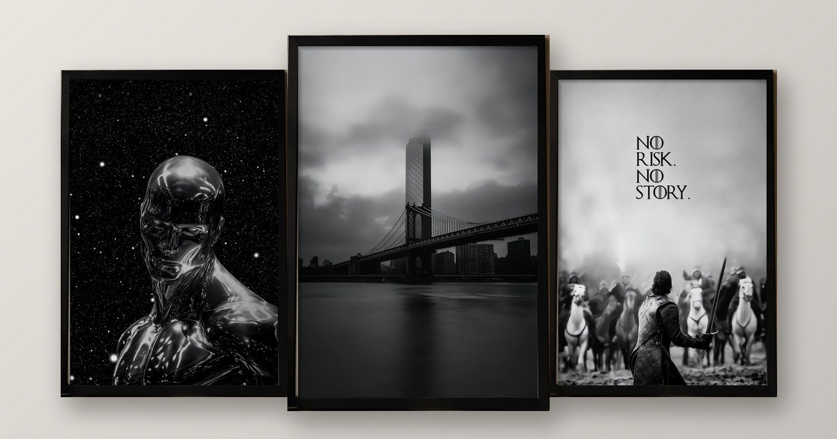
Black and white posters look classy when you add texture, keep the tones consistently warm or cool, and leave plenty of empty wall around them. Use one hero piece, hang its centre near 57 inches, and repeat a single accent colour nearby. That keeps the room sharp without feeling cold.
Black and white feels like the safest choice you can make. No colours clash, and nothing looks out of date. Yet a wall of pure black and white can also feel clinical if you rush it. That is why I treat black and white posters as a styling job, not a shortcut.
In this guide, I cover which posters suit which room, how to add warmth, how to mix in colour and which mistakes to skip. If you want more general ideas first, read our 15 living room wall frame ideas.

Why do black and white posters work in almost every room?
The answer is simple. They remove the biggest decorating risk: colour clashes. White adds visual space, and black gives the eye a place to rest. Home & Decor Singapore notes that an all-white palette makes a space feel larger, while an all-black one creates a cocooning effect.
However, there is a catch. Singapore’s MyNiceHome guide warns that an all black, white and grey interior can look a little flat. It suggests adding texture and framed art to bring dimension. In other words, black and white posters work best as part of a layered room, not as the whole story.
Which black and white posters suit which room?
Match the mood of the poster to the job of the room. A bedroom needs calm. A workspace needs focus. Here is the quick guide I would give a friend.
| Room | Poster style | Why it works |
|---|---|---|
| Living room | Foggy landscape or moody cityscape | Adds depth without competing with furniture |
| Bedroom | Soft, quiet scenes with lots of empty space | Feels restful at night |
| Home office | Bold motivational text | Keeps you focused and reads well on camera |
| Hallway or entrance | Black and white calligraphy | Elegant, readable and welcoming |
| Study or gaming corner | Dramatic racing or futuristic art | Adds energy in a dark palette |

Notice the pattern. Calm rooms take calm art. Busy rooms can handle drama. If you want a black and white calligraphy piece, our guide to Islamic wall frames explains how to hang it respectfully.
How do you stop black and white posters from feeling cold?
Warmth is what separates a classy monochrome room from a clinical one. Fortunately, it takes only three small moves.
- Add texture. Wood, linen, a woven rug and a plant all soften black and white.
- Stay in one temperature. Home & Decor Singapore advises sticking to either warm or cool tones across walls and accessories. A cream white and a bluish white will fight each other.
- Use warm light. Brightness changes the mood a lot in monochrome rooms, because the contrast is already sharp. Choose warm bulbs, and dim them in the evening.

How do you mix black and white posters with colour?
A black and white wall is a perfect stage for one accent colour. Here is the rule I use. I call it the rule of three repeats. Choose one accent colour, and repeat it three times in the room.
For example, pick terracotta. Use it once in a cushion, once in a plant pot and once in a mug on the side table. Because the colour repeats, it looks deliberate. A single random splash, on the other hand, looks accidental.
[INSERT: a real Wall Aura customer story or photo here, for example a customer who paired a black and white poster with a single accent colour.]
Which frame colour suits black and white posters?
Keep it simple. A black frame on a white or cream wall looks sharp and timeless. A white or light frame stands out on a dark wall. Wood suits warm rooms with plenty of natural material.
Whatever you choose, use the same frame colour on the whole wall. Mixed frames make a monochrome room look busy, which defeats the purpose.
How high should you hang black and white posters?
Hang the centre at 57 inches (145 cm) from the floor. That is roughly eye level for an average standing adult, and the Toledo Museum of Art’s hanging guide uses the same centre line. Above a sofa, leave about 6 to 10 inches between the sofa and the frame. Between two frames, keep 2 to 3 inches.
In a monochrome room, empty space matters even more. Do not fill every inch. Space around a poster is what makes it look expensive.

What is my three-tone test before you buy?
This is the checklist I would use myself. If a poster fails one question, wait.
- Is my white warm or cool? Pick the same temperature for the wall, the frame mat and the furniture.
- Do I have one texture nearby? A rug, a plant or a wooden shelf will do.
- Have I chosen one accent colour? Plan where you will repeat it three times.
Which mistakes should you avoid?
- Going fully flat. Without texture, black and white looks sterile.
- Mixing warm and cool whites. The mismatch shows up quickly under light.
- Using too many posters. Three well-spaced frames beat ten crowded ones.
- Forgetting the light. A harsh white bulb turns a calm print cold.
- Hanging too high. Aim for a centre near 57 inches.

I would rather you hang one right black and white poster than five rushed ones. If you rent your home, our guide to hanging frames without drilling shows how to do it safely. And if your wall doubles as a workspace, our guide to office wall frames may help.
Frequently asked questions
Do black and white posters suit every room?
Mostly yes. They avoid colour clashes, so they work in living rooms, bedrooms, hallways and offices. Choose calm landscapes for restful rooms and bold typography for workspaces.
How do I stop black and white posters from feeling cold?
Add texture and warmth. Use wood, linen, a woven rug or cream-white walls, and choose warm light bulbs. Stick to either warm or cool tones across the room so the look stays consistent.
Which frame colour is best for black and white posters?
A black frame on a white or cream wall looks sharp and timeless. On a dark wall, a white or light frame stands out. Avoid mixing frame colours on the same wall.
Can I add colour to a black and white wall?
Yes. Add one accent colour and repeat it about three times, for example in a cushion, a plant and a mug. That repetition makes the colour look planned.
How high should I hang black and white posters?
Place the centre about 57 inches (145 cm) from the floor. Above a sofa, leave 6 to 10 inches between the sofa and the frame. Between frames, keep 2 to 3 inches.
Can I hang black and white posters without drilling?
Yes, if the frame is light. Use adhesive picture strips on a smooth, painted wall, or lean the frame on a shelf. Check the weight rating and let fresh paint cure first.
Ready to choose your poster?
Browse the Wall Aura shop to see what is available now. Not sure which piece suits your wall? Message us through the contact page or on WhatsApp at +92 3099661277. There is no pressure to buy, and I am glad to help.
One thought on “Black and White Posters: A Classy Styling Guide”